

11 Living Room Painting Ideas and Color Schemes
Choosing the right paint color can completely change how your living room looks and feels. The same furniture can appear brighter, warmer, more sophisticated, or more inviting simply because the wall color has changed.
That is why choosing a living room paint color is about more than picking a shade you happen to like at the paint store. You also need to think about natural light, flooring, furniture, ceiling height, room size, and the mood you want to create.
Warm neutrals remain popular because they are easy to live with and work beautifully with wood, linen, leather, and woven textures. But there is no reason to stop at beige. Soft sage green can bring a natural feeling into the room, dusty blue can create a peaceful atmosphere, and warm terracotta can add personality without becoming overwhelming.
I’ve noticed that the most successful color schemes usually contain several related tones rather than one isolated color. A cream wall might work with warm brown furniture, muted green accents, and soft ivory textiles. A deep blue wall can feel much more approachable when balanced with natural wood and warm cream upholstery.
The ideas below are designed to help you choose a palette that looks beautiful in real homes—not just in perfectly styled photographs. You’ll find practical suggestions for pairing wall colors with furniture, choosing accent shades, handling natural light, and creating a finished color scheme that feels cohesive.
Table of Contents
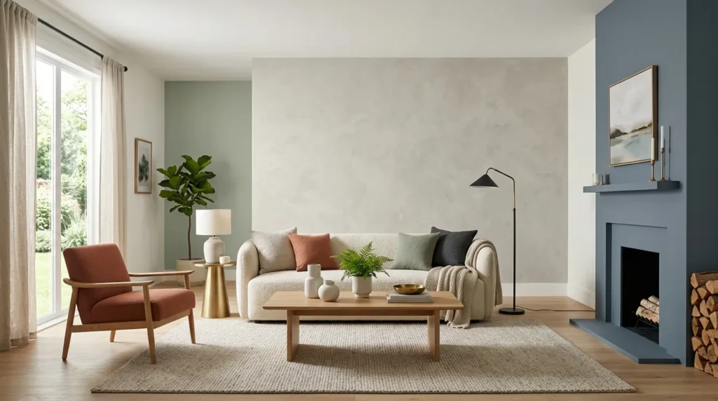
1. Warm White And Beige
Create an inviting neutral foundation with creamy whites and soft beige accents.
2. Soft Sage Green
Bring a calm natural feeling into the living room with muted green walls.
3. Dusty Blue And Cream
Combine soft blue with warm neutrals for a peaceful and timeless room.
4. Greige And Natural Wood
Use a sophisticated gray-beige palette that works beautifully with warm wood.
5. Terracotta And Ivory
Add earthy warmth with muted terracotta balanced by soft ivory tones.
6. Charcoal And Warm Neutrals
Create dramatic depth with charcoal walls softened by cream and natural materials.
7. Soft Taupe And Olive
Layer understated earthy shades for a cozy, nature-inspired living room.
8. Cream And Deep Green
Pair a light neutral foundation with rich green accents for elegant contrast.
9. Blush And Warm White
Use a subtle dusty blush palette for a gentle, welcoming atmosphere.
10. Navy And Natural Beige
Create sophisticated contrast with deep navy balanced by warm natural tones.
11. Earthy Monochromatic Layers
Build a cohesive room using several shades from the same warm color family.
1. Warm White And Beige
Quick Benefits
- Makes rooms feel bright and welcoming
- Works with almost any furniture style
- Creates a timeless backdrop
- Helps small rooms feel more open
- Makes natural materials stand out
Why It Works
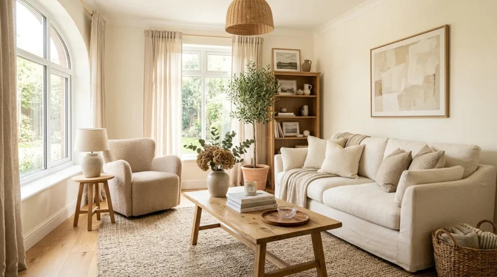
Warm white and beige are among the easiest living room paint combinations to live with because they provide plenty of flexibility. Unlike a stark, cool white, a warm white has subtle creamy or yellow-beige undertones that make the room feel softer.
This palette is especially beautiful when paired with natural materials. Oak furniture, linen sofas, woven baskets, jute rugs, and ceramic accessories all look richer against a warm neutral backdrop.
The secret is to avoid using exactly the same beige everywhere. A room becomes much more interesting when the walls, upholstery, rug, and accessories have slightly different undertones.
Natural light also plays an important role. A creamy white can appear brighter during the day and warmer in the evening, which gives the room a gentle change throughout the day.
How To Style It
Use a warm white on the walls and introduce beige through the sofa, curtains, rug, or accent chairs.
Add contrast with medium-toned wood, aged brass, muted brown, or soft black.
For a cozy look, layer ivory cushions with oatmeal throws and a textured rug. For a more modern room, choose streamlined furniture and keep accessories minimal.
If your living room receives limited natural light, test the paint color first. Warm white can become surprisingly rich in a darker room, which may be exactly what you want.
2. Soft Sage Green
Quick Benefits
- Creates a calming atmosphere
- Connects the room with nature
- Works with warm and cool accents
- Looks beautiful with wood
- Adds color without overwhelming the space
Why It Works
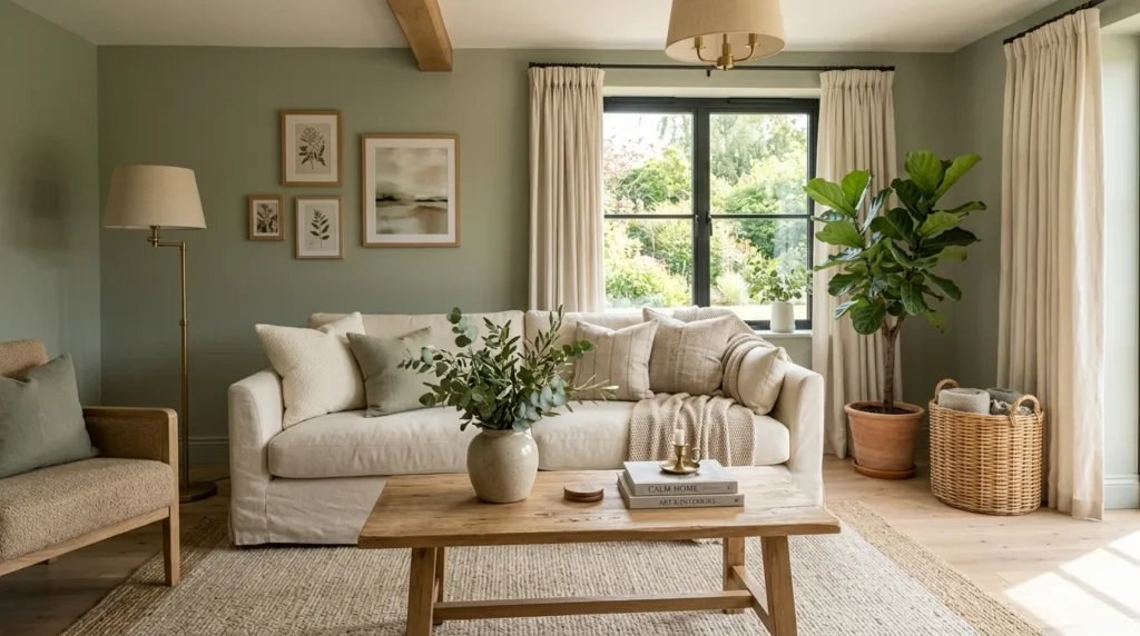
Soft sage green is a wonderful choice when you want color but do not want a highly saturated room. Its muted quality makes it surprisingly versatile.
Sage can feel fresh during the day and cozy in the evening, especially when paired with warm lighting. It also works beautifully with natural materials such as oak, rattan, linen, leather, and stone.
A soft green wall can provide enough personality that you need fewer decorative accessories. This makes it useful for homeowners who prefer a relatively simple interior.
The key is choosing a muted green rather than an extremely bright or yellow-green shade. Soft gray-green undertones tend to create a more sophisticated appearance.
How To Style It
Pair sage walls with cream or ivory upholstery. Add natural wood furniture to bring warmth into the palette.
For accent colors, try muted terracotta, dusty blue, warm beige, or soft brown.
Plants can reinforce the natural feeling, but do not worry about making everything green. A few neutral accessories will help keep the room balanced.
If you are painting the entire room sage, consider keeping the ceiling and trim a warm white for contrast.
3. Dusty Blue And Cream
Quick Benefits
- Creates a peaceful mood
- Works with traditional and modern styles
- Looks beautiful in natural light
- Pairs easily with cream furniture
- Provides subtle color
Why It Works
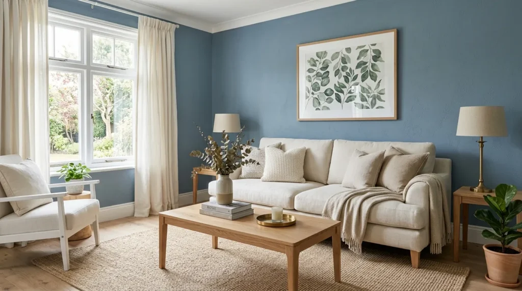
Dusty blue is one of those colors that can feel both classic and contemporary. Its softness makes it easier to live with than a highly saturated blue, while its cool undertones create a refreshing contrast against warm cream and wood.
This palette works particularly well in living rooms with plenty of daylight. The blue can appear airy during the day while becoming richer under warm lamps at night.
Cream is an important partner because it prevents the room from becoming too cool. Natural wood also adds warmth and keeps the color scheme grounded.
How To Style It
Use dusty blue on the walls and choose cream or ivory seating. Add a natural wood coffee table, woven rug, and beige curtains.
For a more traditional room, introduce brass lighting and classic artwork. For a modern space, use black accents and simple furniture.
Small touches of muted navy can add depth without changing the overall softness of the palette.
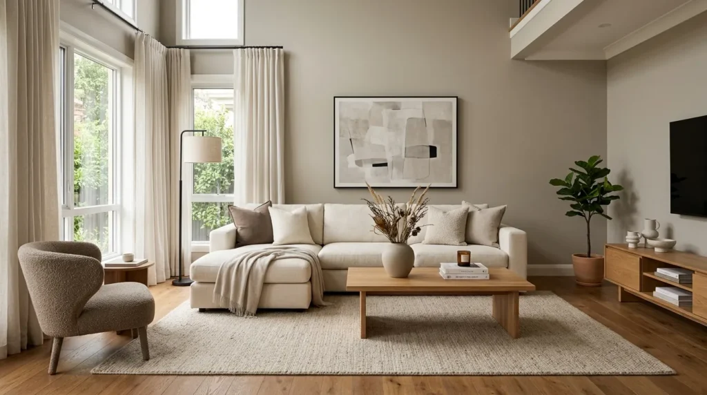
4. Greige And Natural Wood
Quick Benefits
- Blends gray and beige beautifully
- Works with many furniture styles
- Feels sophisticated without being formal
- Complements natural wood
- Provides a flexible neutral backdrop
Why It Works
Greige sits between gray and beige, making it particularly useful when you want a neutral that feels more dimensional than plain white.
The important part is choosing a greige with undertones that work with your existing furniture. Some shades lean warm and beige, while others feel distinctly gray.
Natural wood is an excellent partner because it prevents the gray component from making the room feel cold. Oak, walnut, and medium brown wood can all create beautiful contrast.
This palette is especially practical for open-plan homes because it can transition easily into nearby dining areas, kitchens, and hallways.
How To Style It
Paint the walls a warm greige and use cream, oatmeal, or ivory textiles throughout the room.
Add natural wood furniture and a textured rug. For contrast, use black metal lighting or dark brown accessories sparingly.
If your floors are already gray, choose a warmer greige so the room does not become too cool.
Use artwork with beige, brown, olive, or muted blue to add visual interest without disrupting the neutral palette.
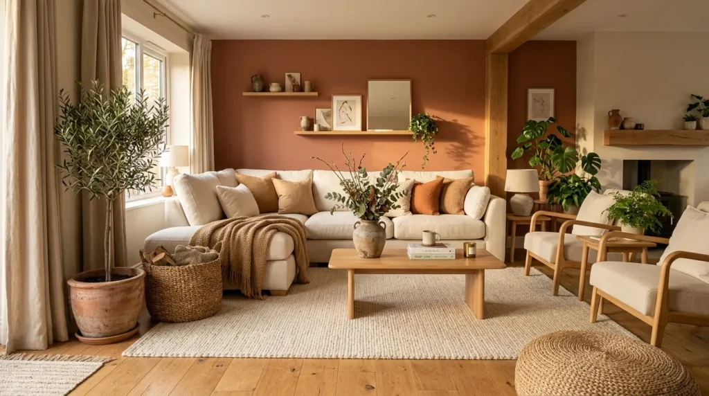
5. Terracotta And Ivory
Quick Benefits
- Adds warmth and personality
- Creates an earthy atmosphere
- Works beautifully with natural materials
- Feels cozy in fall and winter
- Can be softened with neutral furniture
Why It Works
Terracotta brings the warmth of clay, sunbaked earth, and natural stone into the living room. A muted terracotta wall can make a space feel instantly more intimate.
Because terracotta is relatively strong compared with beige or cream, it works best when balanced with plenty of lighter tones.
Ivory, warm white, and natural wood help keep the room from feeling too heavy. Woven textures and greenery can also reinforce the earthy character.
This palette is particularly beautiful in rooms with warm sunlight because the wall color changes subtly throughout the day.
How To Style It
If you are nervous about painting all four walls terracotta, start with one accent wall.
Pair it with an ivory sofa, cream curtains, natural wood table, and beige rug.
Use small amounts of olive green, muted blue, or dark brown for contrast.
Ceramic accessories, woven baskets, and handmade-looking pottery fit naturally into this color scheme.
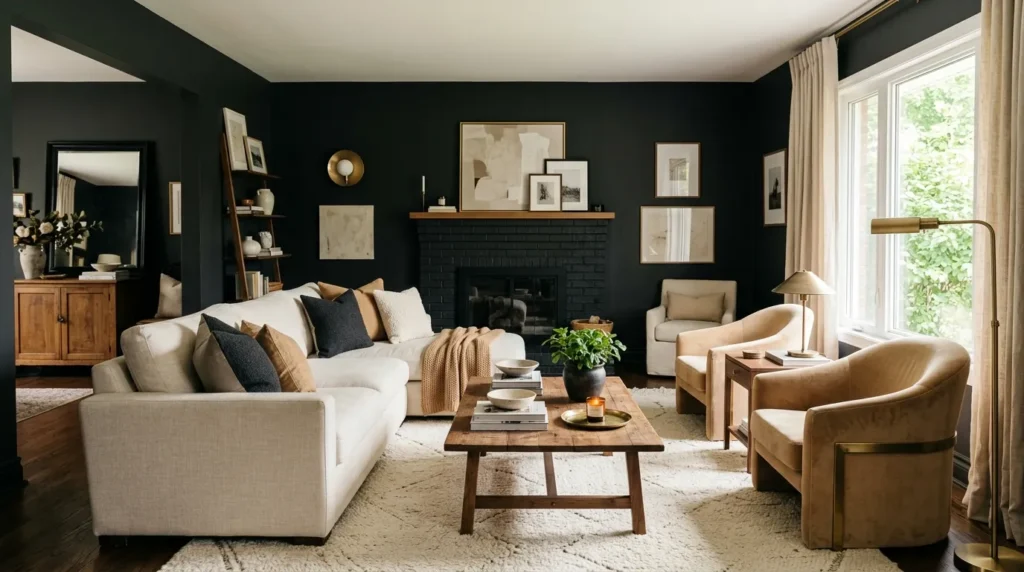
6. Charcoal And Warm Neutrals
Quick Benefits
- Creates dramatic contrast
- Makes light furniture stand out
- Adds sophistication
- Works well in large rooms
- Creates a cozy evening atmosphere
Why It Works
Dark walls can be incredibly beautiful when used intentionally. Charcoal creates depth and makes lighter furniture, artwork, and lighting fixtures stand out.
The key is warmth. Pairing charcoal with cool gray furniture can make the room feel cold, but cream, camel, tan, and natural wood soften the effect.
This palette works especially well in living rooms where you want a cozy, enveloping atmosphere. It can also make a large room feel more intimate.
Natural daylight should be considered carefully. A dark wall in a room with very little light can feel heavy, while a well-lit room can handle charcoal beautifully.
How To Style It
Choose warm white or cream upholstery and introduce natural wood furniture.
Add brass or aged bronze lighting for warmth. Soft beige curtains and a textured rug can prevent the room from feeling too dramatic.
Keep artwork relatively light so it stands out against the charcoal wall.
If painting all four walls feels too bold, use charcoal behind the fireplace, television, or main sofa.
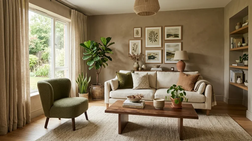
7. Soft Taupe And Olive
Quick Benefits
- Creates an earthy color scheme
- Feels cozy and sophisticated
- Works well with natural materials
- Provides subtle color contrast
- Looks beautiful throughout the year
Why It Works
Taupe and olive create a naturally grounded combination. Both colors have muted qualities, so they can be used together without creating excessive visual contrast.
This palette works particularly well in rooms with wood furniture, woven textures, linen, leather, and stone.
Taupe provides the neutral foundation, while olive adds a subtle connection to nature. Together, they create a room that feels warm without relying on traditional beige alone.
How To Style It
Use warm taupe on the walls and introduce olive through accent chairs, pillows, artwork, or curtains.
If you want stronger color, use olive on one accent wall and keep the rest of the room taupe.
Add cream upholstery, dark wood, brass accents, and greenery.
For a modern look, choose clean-lined furniture. For a more traditional room, add vintage-inspired artwork and classic lighting.
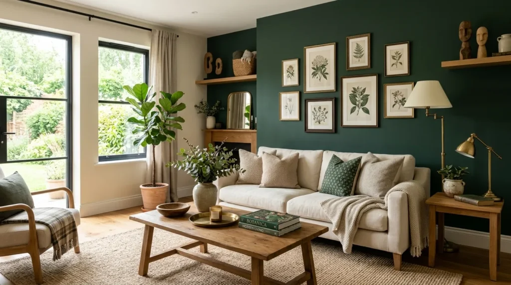
8. Cream And Deep Green
Quick Benefits
- Creates elegant contrast
- Adds rich natural color
- Makes neutral furniture stand out
- Works beautifully with brass
- Creates a sophisticated atmosphere
Why It Works
Deep green can make a living room feel dramatic and sophisticated without the severity of black. When paired with cream, it creates a strong but balanced contrast.
This palette works especially well in rooms with traditional architecture, fireplaces, wood floors, or substantial furniture.
Deep green can also create a cozy library-like atmosphere, making it particularly appealing for living rooms designed for reading and relaxing.
How To Style It
Use deep green as an accent wall if you want to keep the overall room light. Pair it with cream upholstery and warm white curtains.
Natural wood is essential for preventing the palette from feeling too formal.
Add brass lamps, vintage artwork, and muted botanical accents.
For a more modern appearance, keep the furniture simple and use black details sparingly.
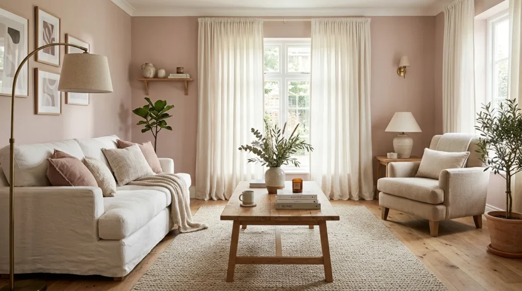
9. Blush And Warm White
Quick Benefits
- Creates a gentle atmosphere
- Adds subtle color
- Works beautifully with warm neutrals
- Feels soft without being overly feminine
- Complements brass and wood
Why It Works
A muted blush or dusty rose can add warmth to a living room without becoming overpowering. The key is choosing a sophisticated, dusty version rather than a bright pink.
Warm white provides the perfect balancing color. Together, they create a room that feels soft, welcoming, and slightly romantic.
This palette works especially well when combined with natural wood and aged brass. These materials give blush a more mature appearance.
How To Style It
Use blush on one wall or throughout the room if the shade is subtle enough.
Pair it with cream furniture, warm white curtains, natural oak, and beige rugs.
Introduce small amounts of muted terracotta or brown for depth.
Aged brass lighting and soft artwork can complete the look without making the room feel overly decorative.
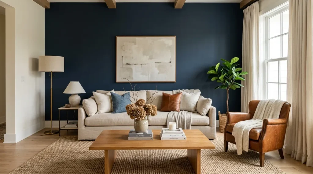
10. Navy And Natural Beige
Quick Benefits
- Creates strong contrast
- Feels classic and sophisticated
- Works with traditional and modern interiors
- Looks beautiful with wood
- Adds depth to neutral rooms
Why It Works
Navy is a classic color for a reason. It adds depth and personality while remaining relatively easy to pair with neutrals.
Natural beige softens navy and prevents the room from feeling too dark. Wood furniture adds another layer of warmth.
This palette is especially effective in living rooms where you want a traditional foundation with a slightly more dramatic modern edge.
Navy also works beautifully with brass, cream, cognac leather, and natural woven materials.
How To Style It
Use navy on an accent wall behind the sofa or fireplace. Pair it with beige upholstery, cream curtains, and a natural wood coffee table.
For a stronger contrast, add small black accents. For a softer look, use dusty blue and warm brown instead.
Keep patterns simple. Stripes, subtle geometric prints, and understated botanical artwork can complement the palette.
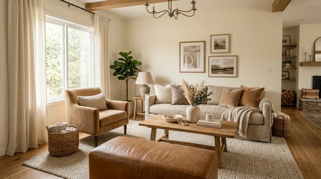
11. Earthy Monochromatic Layers
Quick Benefits
- Creates a cohesive appearance
- Makes neutral rooms feel sophisticated
- Allows textures to stand out
- Works in modern and traditional homes
- Easy to update over time
Why It Works
A monochromatic color scheme does not mean using one exact color everywhere. Instead, it means choosing several shades within a related color family.
An earthy living room might combine cream, sand, camel, taupe, caramel, and warm brown. Because the colors are closely related, the room feels naturally coordinated.
Texture becomes especially important in monochromatic spaces. Linen, wool, wood, leather, ceramics, and woven materials prevent the palette from looking flat.
This is a wonderful approach if you want a timeless living room that can evolve without requiring a complete repaint every few years.
How To Style It
Choose the lightest shade for the walls, then gradually introduce deeper tones through furniture and accessories.
For example, use warm cream walls, a beige sofa, camel accent chair, oak coffee table, and brown leather accessories.
Add one small contrasting shade such as muted olive or soft black if the room needs more definition.
Use artwork to bring together the different shades. Landscape and abstract pieces with earthy colors are particularly effective.
How To Choose the Right Living Room Paint Color
Before committing to a paint color, consider the room’s natural light.
A south-facing room with strong sunlight can handle deeper or cooler colors, while a north-facing room often benefits from warmer shades.
Your flooring also matters. Warm wood floors pair beautifully with cream, taupe, sage, and earthy colors. Cool gray flooring may require a carefully chosen neutral so the room does not feel too cold.
Look at your existing furniture as well. If you already have a brown leather sofa, for example, warm cream, sage, taupe, or dusty blue can complement it beautifully.
Always test paint samples on the actual wall. A color can look completely different depending on the time of day and the surrounding finishes.
How Many Paint Colors Should a Living Room Have?
You do not need many paint colors to create a beautiful living room. In most cases, one primary wall color plus one or two accent shades is enough.
Think of the room as a color story:
- 60%: dominant color, usually walls and large furniture
- 30%: secondary color, such as rugs, curtains, or chairs
- 10%: accent color, such as artwork, pillows, or accessories
This is a useful starting point rather than a strict decorating rule.
The most important thing is that the colors relate to one another.
How To Test Living Room Paint Colors
Paint samples are essential because colors can change significantly under different lighting.
Place sample boards or large painted areas on several walls rather than looking at one tiny swatch.
Check the color:
- In morning light
- In afternoon sunlight
- On a cloudy day
- Under your evening lamps
- Beside your furniture
- Next to your flooring
- Near your trim and ceiling
A color that looks perfect in a store may appear noticeably different once it is surrounded by your home’s existing materials.
If you’re choosing between two similar shades, live with the samples for several days before deciding.
Conclusion
The right living room paint color can completely change the personality of your home. Whether you prefer warm neutrals, soft greens, dusty blues, earthy terracotta, dramatic charcoal, or rich navy, the best color scheme is one that works with your lighting, furniture, architecture, and everyday lifestyle.
Start by deciding how you want the room to feel. If you want bright and timeless, try warm white and beige. For something nature-inspired, sage and taupe are beautiful choices. If you want more drama, charcoal or deep green can create a cozy, sophisticated atmosphere.
Remember that paint does not exist on its own. The final result depends on everything around it—the flooring, furniture, curtains, artwork, lighting, and accessories.
If you’re unsure, start small. Test a few samples, observe them throughout the day, and choose the shade that consistently makes your room feel the way you want it to feel.
A beautiful living room does not require the trendiest color. It needs a color scheme that makes you happy to come home, sit down, and stay awhile.
Related Articles
- 15 Cozy Living Room Color Ideas for a Warm Home
- 12 Neutral Living Room Ideas for a Timeless Look
- 11 Modern Living Room Decorating Ideas
- 15 Small Living Room Ideas to Maximize Space
- 12 Beautiful Living Room Wall Decor Ideas